The Anatomy of a High-Converting Landing Page
Call-To-Action Above the Fold
Where is the call-to-action (CTA) located on your landing page? The golden rule when designing a landing page is to place the CTA above the fold, meaning the visitor does not have to scroll down to see or click the CTA. If your CTA is placed below the fold, it may deter some users from clicking it, simply because they don’t want to scroll. Don’t take my word for it, though. Perform an A-B split test of two different landing pages — one with the CTA above the fold and another with the CTA below the fold — and see which one performs the best (hint: it’s the first).
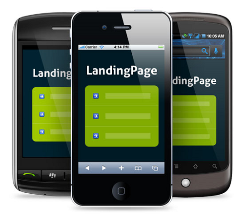
Mobile-Friendly
A proper landing page should also be fully compatible on mobile devices. We’ve talked about this before on the WeDoInfusionsoft blog, but it’s worth mentioning again that more people now access the Internet on smartphones and tablets than desktops. If you fail to cater to the ever-growing demographic of mobile Internet users, you are essentially leaving 50% of your potential traffic up for grabs — and guess who’s going to get it? Your competitors. Make sure your landing is mobile-friendly by running it through Google’s testing tool at https://www.google.com/webmasters/tools/mobile-friendly/.
Limited Links
Another element of a high-converting landing page is a minimum amount of links, both internal and external. Landing pages differ from traditional content-driven websites and blogs in the sense that their sole purpose is to entice visitors to take action. This might be purchasing a product or service, submitting their email address, or clicking on an advertisement. And the more links you include in your website, the fewer “actions” will be taken by visitors.
You have to remember that each time a visitor clicks a navigation link is a possible click that could have been used to make a sale. For this reason, it’s recommended that you keep links on your landing page to a minimum.
Clean, Attractive Design
Of course, your landing page’s design will go a long way in attracting conversions. One simple yet effective design tactic is to use a red-colored CTA button placed against a white background. The contrasting scheme of the red on the black makes the CTA pop; thus, drawing visitors attention to it while encouraging more conversions in the process.
You can even go one step further by using a mouse-over effect when the visitor hovers his or her cursor over the CTA button. Studies have shown that buttons with mouse-over effects are clicked more than similar buttons without mouse-over effects.
These are just a few things to keep in mind when designing your landing page. Above all else, though, be sure to measure the results of your landing page to see what’s working and what’s not.
Have any other landing page tips that you would like to share with our readers? Let us know in the comments section below!
Make it mobile friendly!!! I cannot believe that there are still sites that are not mobile friendly. Most people access the internet on the go now. If they attempt to use your site and are unable to easily navigate it, they are going to leave it.
I’m a firm believer in keeping it simple and highlighting some testimonials on the landing page.
I’ve actually been told not to include links on my landing page at all. I also try not to request more information than is truly needed.